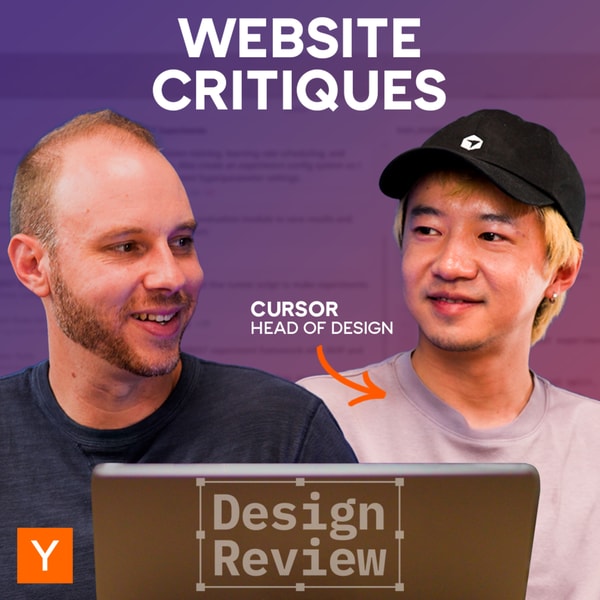
Cursor Head of Design Reviews Startup Websites
Y Combinator Startup Podcast
2025/11/20
Cursor Head of Design Reviews Startup Websites
Cursor Head of Design Reviews Startup Websites

Y Combinator Startup Podcast
2025/11/20
In this episode, design and engineering leader Ryo Lu joins Aaron Epstein to dissect the strengths and weaknesses of startup product websites, particularly those built by YC founders. With a sharp eye for clarity and user experience, Ryo examines how small design and messaging choices can dramatically impact whether a visitor instantly 'gets' what a product does—or quickly clicks away.
Ryo Lu highlights common pitfalls in early-stage startup websites, including unclear value propositions, confusing branding between open-source and commercial versions, and overreliance on generic AI aesthetics. He emphasizes the importance of clear, audience-specific messaging, visual consistency, and intuitive navigation. Websites that lead with jargon or flashy design often fail to communicate their core offering, while simpler, focused layouts with strong calls to action perform better. For platforms requiring trust—like tax or customer service tools—design clarity and meaningful feedback during user delays are critical. Ryo also critiques intrusive sign-up walls and non-functional UI elements, advocating for free exploration, better error handling, and showcasing real user projects to build credibility and engagement.
07:49
07:49
Websites should clearly explain what the product is, who it's for, and why it's different.
10:08
10:08
A chart that looks like an Excel screenshot hurts professional perception
17:41
17:41
Startups should focus on explaining their product, not just showcasing YC backing.
22:58
22:58
Freya Voice provides natural-sounding, multilingual AI agents for 24/7 customer service.
33:38
33:38
Showcasing others' projects can improve user engagement and understanding.